Color Contrast Checker
| WCAG Standard | Small Text | Large Text, UI Components, & Graphical Objects |
|---|---|---|
| AA | - | - |
| AAA | - | - |
How Color Contrast Checker Works?
No complex setup. Just follow these quick steps:
Enter Your Colors
Input your foreground (text) and background colors using HEX or RGB formats. You can type or paste values directly, no design software needed.
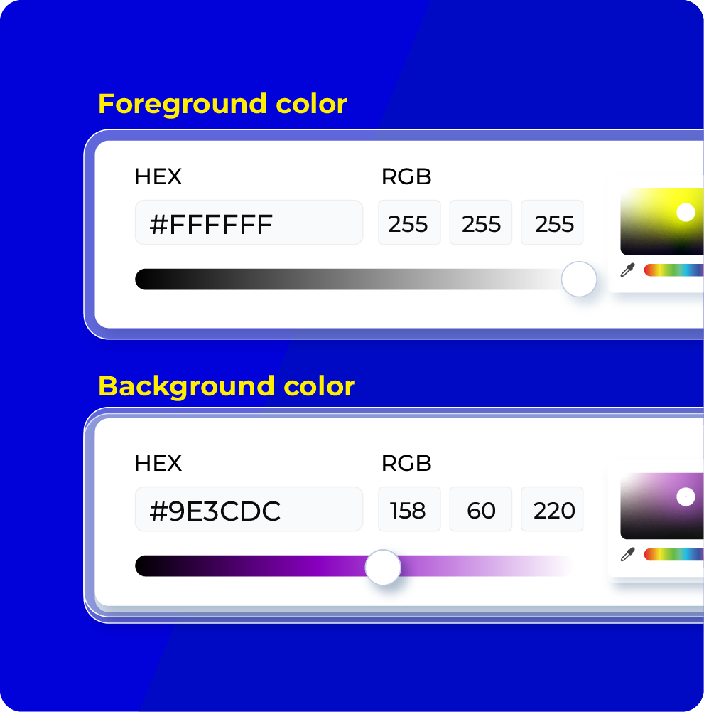
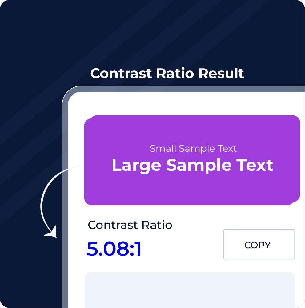
View Contrast Ratio Instantly
As soon as you enter the colors, the tool calculates the contrast ratio using the WCAG-recommended luminance formula. You'll see a number like 4.5:1 or 7:1; higher is better.
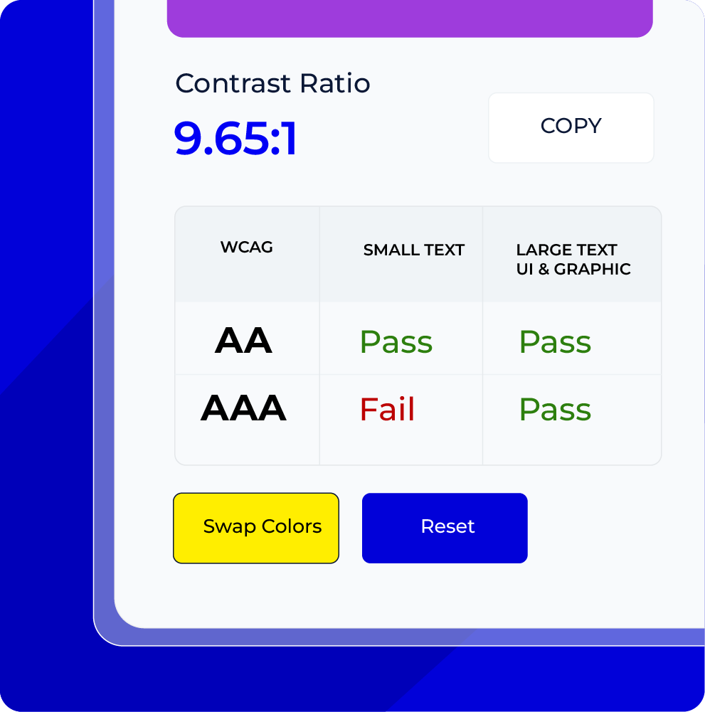
Check and Adjust WCAG Compliance
Instantly see if your color combination meets WCAG AA or AAA standards for normal and large text. If it doesn’t, tweak the colors live until it passes.
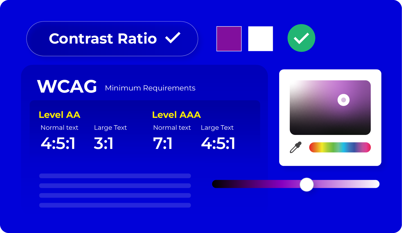
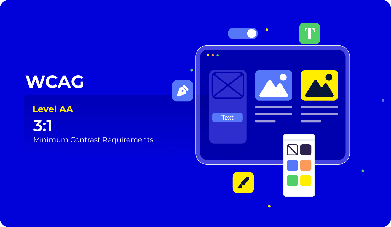
WCAG Color Contrast Standard, Ratios and Requirements
Color Contrast Use Cases
Make sure your visuals look great and accessible.
- Test buttons, links, menus, and form fields for contrast across all states (hover, active, focus, disabled)
- Ensure text is legible against background images or gradients
- Maintain visual consistency without compromising accessibility
- Balance aesthetics with function using accessible color schemes
- Preview designs in high-contrast and low-vision modes

Build interfaces that are functional and compliant.
- Verify all text and UI elements meet WCAG 2.1 AA or AAA compliance
- Adapt components for light and dark mode themes
- Ensure color contrast holds up across responsive layouts
- Prevent accessibility issues before deployment
- Integrate contrast checks into CI/CD or testing workflows

Create visuals everyone can understand.
- Choose accessible color palettes for charts, infographics, and data visualizations
- Avoid relying on color alone to communicate key information
- Ensure overlay text on images is readable
- Make social media graphics and carousels more inclusive
- Reach a wider audience, including those with visual impairments

Make content easy to read and engaging.
- Improve page performance by enhancing text clarity
- Lower bounce rates caused by poor readability
- Support inclusive design strategies that benefit all users
- Increase time-on-page and conversions with better visibility
- Ensure designs are audit-ready for accessibility reports

Accessible design benefits every user.
- Check contrast in emails, mobile apps, landing pages, and dashboards
- Make sure content works in various lighting conditions and screen types
- Improve readability across browsers, devices, and operating systems
- Create inclusive, compliant digital experiences from the start
- Use contrast checking as a key part of your QA or design process
How to Choose Visually Friendly Color Combinations
DO’S: ✔️ | DON’T: ❌ |
| ✔️ Start with your primary brand color | ❌ Sacrifice readability for style |
| ✔️ Use colors that align with meaning and emotion | ❌ Use low-contrast text, it’s hard on the eyes |
| ✔️ Add plenty of white space for better readability | ❌ Use pure black on pure white, it can cause eye strain |
| ✔️ Use different shades of your brand colors to create harmony | ❌ Rely only on color to convey information |
Disclaimer ❗
“This tool calculates contrast ratios for solid color pairs using WCAG 2.1 standards. However, it does not account for gradients, transparency, hover states, or font styling, which may still affect readability. Always test colors in full design context.”
Frequently Asked Questions
A color contrast checker is a tool that helps you measure the contrast between two colors, typically text and background, to see if they meet accessibility standards under the WCAG (Web Content Accessibility Guidelines).
Strong contrast makes content easier to read for everyone, especially users with low vision or color blindness. It’s a key part of digital accessibility and is required under WCAG, ADA, and Section 508 laws.
- AA is the minimum recommended level for accessibility.
- AA requires a contrast ratio of:
- 4.5:1 for normal text
- 3:1 for large text
- AAA is more strict and often used in high-accessibility environments.
- AAA requires:
- 7:1 for normal text
- 4.5:1 for large text
WCAG defines large text as 18pt (24px) or 14pt (18.66px) bold and larger. Large text has slightly more lenient contrast requirements.
No. This tool checks only color contrast. Full accessibility includes many other factors like keyboard access, screen reader support, proper semantics, and more.
This tool is designed for solid color backgrounds and text. It does not currently support contrast testing for images, gradients, or patterned backgrounds.
Contrast ratios are calculated using the WCAG-defined luminance formula. Results are accurate for solid color combinations, but always verify contrast in the final design environment.

