ARIA Basics: When and How to Use ARIA

Web accessibility is not a "nice-to-have"; rather, it is a must-have. Yet, according to the 2024 WebAIM Screen Reader User Survey, more than 96% of homepages have detectable accessibility issues. Such issues often prevent users with visual or cognitive disabilities from efficiently navigating through content.
To developers, this gap is more than just a compliance risk-it's a usability failure. When key page elements like custom buttons, sliders, and modals aren't coded accessibly, screen readers can't read or convey them properly.
This is where ARIA, or Accessible Rich Internet Applications, steps in. ARIA essentially acts as a bridge between modern, dynamic interfaces and assistive technologies by adding in meaningful context to custom UI elements.
This blog will cover the basics of how ARIA works, when it should be used, and how developers can use best practices with real-world examples to increase the accessibility of the web.
The Core Principles of ARIA
Web applications today frequently depend on custom JavaScript components that extend left the bounds of the native behavior of HTML elements. While better interactivity is a great benefit, in turn, it can easily destroy accessibility if it is not coded correctly.
ARIA is available to prevent accessibility issues and help ensure custom, dynamic elements are perceivable, operable, and understandable.
What ARIA is meant to do beyond the scope of semantic HTML
ARIA is not replacing HTML, it's a way to add meaning to an element when HTML does not provide enough meaning on its own.
In simpler terms:
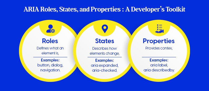
- ARIA provides roles to define what an element is (e.g., button, tab, dialog).
- It uses states and properties to define how that element acts.
This all means ARIA provides tools that are available for assistive technologies, such as screen readers, to understand how everything works and to announce custom elements appropriately.
Example:
<div role="button" aria-pressed="false" tabindex="0">Play</div>
This tells a screen reader that the <div> behaves as a button, even though it isn’t one by default.
Understanding the Relationship Between ARIA, the DOM, and Accessibility APIs
The purpose of ARIA attributes is not to change HTML, but rather the Accessibility Tree, which is the unseen structure that browsers will create for assistive technologies.
How It Works:
- The DOM (Document Object Model) is the representation of visible HTML elements.
- The Accessibility Tree is a reflection of those elements, but with semantic data.
- Accessibility API’s (MSAA, UIA, AXAPI) are what expose that data, as on a screen reader.
| Layer | Purpose | Example |
| DOM | Defines the structure of the page | <div> element |
| ARIA | Adds meaning to non-semantic elements | role="button" |
| Accessibility API | Sends that meaning to assistive tech | Screen reader announces “Button” |
How ARIA Enhances the Accessibility Tree for Non-Semantic Components
When developers use a simple or for interactive elements, those elements are not natively semantic. ARIA fills the gap by:
- Adding semantic meaning (for example role="menu")
- Indicating interaction states. (e.g., aria-expanded="true")
- Keeping user of assistive technology in the real-time loop, when UI states change
This granularity gives custom UI components the same behavior as native elements, and enhances accessibility across devices and assistive technologies.
The Difference Between Semantic HTML and ARIA Roles
It’s important to understand that ARIA should only be used when necessary.If a native HTML element can do the job, use it instead.
| Feature | Semantic HTML | ARIA Equivalent | Recommendation |
| Button | <button> | <div role="button"> | Use native HTML |
| Heading | <h1> | <div role="heading" aria-level="1"> | Use native HTML |
| Checkbox | <input type="checkbox"> | <div role="checkbox"> | Use native HTML |
| Modal Dialog | <dialog> | <div role="dialog"> | Use ARIA when custom UI is required |
Main point:
- If possible, always use semantic HTML first.
- Only use ARIA to enhance, never replace, semantics.
Understanding ARIA's principles allows developers to code visually appealing interfaces that also incorporate accessibility in the markup.
In the following chapter, we will analyze the ARIA Roles, States, and Properties toolset, which are the building blocks developers use to make an interactive element accessible.
ARIA Roles, States, and Properties: A Developer’s Toolkit

When custom UI elements, such as dropdowns, accordions, and modals are being developed, native HTML semantics often fail to meet the needs of the element. This is where ARIA roles, states and properties play a role.
ARIA roles assist developers with defining what an element is doing, its relationship to other elements, and how assistive technology will understand the interface.
Overview of ARIA Roles and What They Say About an Element's Purpose
Each ARIA role gives meaning to what an element is doing in the interface. Think of roles as the "job title" of HTML elements, roles are what dictates what something does.
Examples:
- A <div role="button"> behaves like a button for screen readers.
- A <section role="region"> defines a named content area.
- A <nav role="navigation"> signals a set of navigational links.
Quick Tip:
Use ARIA roles only when no semantic HTML element (like <button> or <nav>) can serve the same purpose.
ARIA Roles Categories
ARIA roles fall into three main categories, Landmark, Widget, and Live Region roles.Each category serves a different purpose within accessible web design.
Landmark Roles
Landmark roles help users navigate large web pages efficiently through screen readers.
Common Landmark Roles:
- banner – Defines site-wide header content.
- main – Marks the primary content area.
- navigation – Identifies a collection of navigation links.
- contentinfo – Represents site-wide footer information.
Example:
<header role="banner">
 <nav role="navigation">
   <ul>
     <li><a href="#">Home</a></li>
     <li><a href="#">Docs</a></li>
   </ul>
 </nav>
</header>
<main role="main">
 <p>Welcome to our documentation site.</p>
</main>
<footer role="contentinfo">© 2025 Accesstive</footer>
Widget Roles
Widget roles describe interactive components that users can manipulate directly.
Examples include:
- button – Clickable control to trigger actions.
- tab – Selectable tab in a tablist.
- dialog – Modal or popup content container.
- slider – Interactive input control for numeric values.
Example:
<div role="button" aria-pressed="false" tabindex="0">
 Toggle Theme
</div>
Screen readers will identify this as a button, even though it’s a <div>.
Live Region Roles
Live region roles communicate real-time updates to users, ideal for dynamic notifications.
Common Roles:
- alert – Urgent message requiring immediate attention.
- status – Non-critical system status message.
- log – Sequential update list (like chat or logs).
Example:
<div role="alert" aria-live="assertive">
 Form submission failed. Please try again.
</div>
Working with States and Properties
Roles define what an element is, states and properties define how it behaves.They communicate dynamic changes and descriptive context to assistive technologies.
Common States
Used for UI components that can toggle or change condition.
- aria-expanded – Indicates if a collapsible element is open or closed.
- aria-checked – Marks if an item (like a checkbox) is selected.
- aria-pressed – Identifies toggle buttons’ on/off state.
Example:
<button aria-expanded="false" aria-controls="menu1">Menu</button>
<ul id="menu1" hidden>
 <li><a href="#">Profile</a></li>
</ul>
Descriptive Properties
Used to give screen readers more context about what an element does or controls.
- aria-label – Provides an accessible name when no visible label exists.
- aria-labelledby – References another element that labels it.
- aria-describedby – Points to extra descriptive text.
Example:
<input type="text" aria-label="Search site" />
Live Updates and Dynamic Behavior
For content that changes automatically, ARIA live regions notify users without refreshing the page.
- aria-live – Announces updates (off, polite, or assertive).
- aria-busy – Indicates that content is being updated or loading.
Example:
<div aria-live="polite">
 Loading data, please wait…
</div>
Managing Relationships and Hierarchies
ARIA also defines relationships between elements, helping assistive tech understand component structure.
- aria-owns – Establishes parent-child relationships across DOM nodes.
- aria-controls – Indicates an element controls another element.
- aria-activedescendant – Identifies the active child element in a composite widget (like autocomplete).
Example:
<ul id="options" role="listbox">
 <li id="opt1" role="option">Apple</li>
 <li id="opt2" role="option">Banana</li>
</ul>
<input aria-activedescendant="opt2" aria-controls="options" />
By mastering ARIA roles, states, and properties, developers gain fine-grained control over accessibility behavior, without sacrificing interactivity.
In the next section, we’ll explore how to apply ARIA in custom components, where these attributes come to life in real-world UI patterns.
Implementing ARIA Step-by-Step (Checklist & Process)
Implementing ARIA effectively is about strategy, not guesswork.Follow this streamlined process to make sure your components are accessible, testable, and standards-compliant.
Accessibility Checklist Before Adding ARIA
Before using ARIA, confirm that your base HTML and interaction patterns already support accessibility.
Quick Checklist:
- Use semantic HTML before ARIA (e.g., <button> over <div>).
- Ensure keyboard navigation works (Tab, Enter, Space).
- Verify visible labels and accessible names exist for inputs and controls.
Pro Tip:
Use Color Contrast Checker to verify text readability before testing ARIA.
Step-by-Step Integration Guide
Building with ARIA becomes easier when you follow a predictable flow.
1. Identify custom components lacking semantics
Example: custom dropdowns, modals, sliders.
2. Choose appropriate ARIA roles and properties
Example: role="dialog", aria-expanded="true", aria-controls="menu1".
3. Apply ARIA attributes programmatically
button.setAttribute('aria-expanded', 'true');
4. Test with screen readers
- NVDA (Windows)
- VoiceOver (macOS)
- JAWS (Enterprise use)
Validation Tools and Testing
Testing ensures your ARIA attributes behave as intended.
Automated Tools:
- Lighthouse – Basic accessibility audit.
- axe DevTools – In-depth ARIA and contrast testing.
- WAVE – Visual accessibility checker.
- Access Audit – AI-driven audit to detect and track ARIA issues quickly.
Manual Validation:
- Use browser Accessibility Inspectors to confirm that ARIA roles, names, and states appear correctly in the Accessibility Tree.
Accessibility isn’t a one-time fix, it’s an ongoing practice.By combining semantic HTML, proper ARIA, and continuous testing, developers can ensure their interfaces are both interactive and inclusive.
Next, we’ll explore common ARIA mistakes and best practices to help you avoid accessibility pitfalls.
Common Developer Mistakes and ARIA Best Practices

Even experienced front-end developers can unintentionally harm accessibility by misusing ARIA. This section outlines the most frequent pitfalls and the proven best practices for keeping interfaces inclusive, stable, and screen-reader friendly.
Typical Mistakes
ARIA is powerful, but misapplied attributes often cause more harm than good.
Below are common mistakes developers make when implementing ARIA.
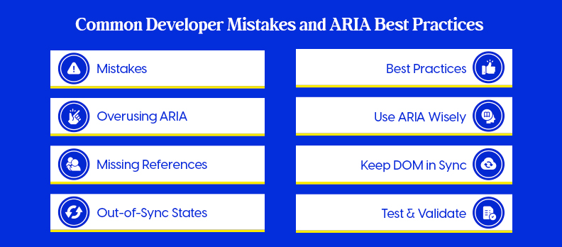
Overusing ARIA Where Native HTML Elements Suffice
- Using <div role="button"> instead of <button>.
- Adding redundant roles such as <nav role="navigation">.
Use native HTML elements whenever possible. They’re already accessible and require no extra configuration.
Mismatched or Missing ARIA References
- aria-labelledby="title" without an element having id="title".
- aria-controls pointing to non-existent or dynamically removed elements.
These mistakes break relationships in the Accessibility Tree and confuse assistive technologies.
Poor Synchronization Between UI State and ARIA Attributes
- A button visually toggles, but aria-pressed remains false.
- A dropdown opens, but aria-expanded still reports false.
- Always synchronize ARIA attributes with the component’s JavaScript state.
Best Practices
Correct ARIA usage depends on following structured, consistent coding habits.
Use these guidelines to ensure your accessibility implementation remains accurate.
Follow the Rule: “No ARIA Is Better Than Bad ARIA”
If an element works accessibly with native HTML, don’t override it with ARIA. Let HTML handle the semantics; apply ARIA only to custom components.
Keep Roles, States, and DOM in Sync
- Update attributes like aria-expanded and aria-checked in real time.
- Make sure state changes in the DOM reflect instantly in screen readers.
Always Test with Real Assistive Technologies
Simulated checks aren’t enough. Test using:
- NVDA (Windows)
- VoiceOver (macOS/iOS)
- JAWS (Enterprise Environments)
Verify that navigation, announcements, and focus behaviors work as intended.
Validate Using W3C and Browser Accessibility APIs
- Run your pages through the W3C validator and browser DevTools accessibility panel.
- Use platforms like Compliance Hub to confirm adherence to accessibility standards such as WCAG 2.2.
Integrate Accessibility Checks into CI/CD Pipelines
Automate accessibility testing as part of your development workflow. Tools like axe-core, Pa11y, or Access Service help detect regressions before deployment.
Good ARIA usage enhances accessibility without adding unnecessary complexity. In the next section, we’ll explore a practical ARIA Examples Library with real-world code snippets to demonstrate these principles in action.
ARIA Examples Library (with Code Snippets)
The best way to understand ARIA is through hands-on implementation. Below are quick, real-world examples showing how ARIA enhances common UI components.
Example 1: Accessible Accordion using aria-expanded and aria-controls
Accordions are common in FAQs and menus. Use aria-expanded to show open/closed state and aria-controls to link to content.
<button aria-expanded="false" aria-controls="panel1" id="accordion1">
 More Details
</button>
<div id="panel1" hidden>
 <p>Additional information displayed here.</p>
</div>

const btn = document.getElementById('accordion1');
btn.addEventListener('click', () => {
 const expanded = btn.getAttribute('aria-expanded') === 'true';
 btn.setAttribute('aria-expanded', !expanded);
 document.getElementById('panel1').hidden = expanded;
});
Example 2: Custom Toggle Button with aria-pressed
Toggle buttons visually switch states, but ARIA ensures screen readers understand the state change.
<button id="darkMode" aria-pressed="false">Dark Mode</button>

const toggle = document.getElementById('darkMode');
toggle.addEventListener('click', () => {
 const pressed = toggle.getAttribute('aria-pressed') === 'true';
 toggle.setAttribute('aria-pressed', !pressed);
});
Example 3: Dynamic Notification System with aria-live="assertive"
Live regions announce messages dynamically without user interaction. Use aria-live="assertive" for urgent updates like errors or alerts.
<div id="alertBox" aria-live="assertive"></div>

function showAlert(message) {
 document.getElementById('alertBox').textContent = message;
}
showAlert('Form submission failed. Please check your inputs.');
How to Test Each Component for Accessibility
- Keyboard Navigation:
Use Tab, Enter, and Space to ensure interaction without a mouse. - Screen Reader Testing:
- NVDA or JAWS (Windows)
- VoiceOver (macOS)
- Validation:
Run quick checks with axe DevTools or Lighthouse.
Real-World Usage Examples in Modern Frameworks
- React: Use aria-* attributes directly on JSX elements.
- Vue: Bind ARIA dynamically with :aria-expanded or :aria-pressed.
- Svelte: Update ARIA attributes reactively using $: syntax.
Small ARIA additions like these can make the difference between a usable and unusable interface. Next, we’ll wrap up with final thoughts and key takeaways for accessibility-driven development.
Conclusion
Accessibility is a core part of quality web development, not an afterthought. By using ARIA correctly, developers can make modern interfaces accessible, inclusive, and user-friendly.
If you’re unsure where your site stands, start with a free accessibility Audit. It’s a quick way to uncover usability, SEO, and inclusivity improvements in one step.
Building with accessibility in mind ensures better performance, compliance, and user satisfaction, for everyone.
FAQs
ARIA stands for Accessible Rich Internet Applications. Use it only when native HTML elements or attributes can’t provide the needed semantics or behavior.
HTML semantics are built-in and automatically recognized by browsers. ARIA roles manually define meaning for custom components that lack native semantics.
Yes, ARIA can describe a <div>’s role and state (e.g., role="button"), but it still needs keyboard handling (Tab, Enter, Space) for full accessibility.
Test with screen readers like NVDA, VoiceOver, or JAWS. Use keyboard navigation to confirm correct focus, labels, and announcements.
Use axe DevTools, WAVE, Lighthouse, or Access Audit to detect errors and verify ARIA attributes.
React already supports many accessible patterns. Use ARIA only for fully custom components or when native HTML elements can’t achieve the same behavior.


