Accessible Navigation Made Easy: Menus, Links, and Buttons That Work for Everyone
Why Navigation Matters for Accessibility
Website navigation goes beyond menus and hyperlinks. It encompasses whatever process helps the user navigate your content. Navigation reveals overall structure to a user. If it's not clear, or if it's inconsistent, the user can get lost or confused. Also, accessible navigation makes sure that every user - including those with disabilities - can navigate for information freely without barriers.
Tools like Access Widget can assist in aligning your menus, links, and buttons with accessibility standards consistently across your site.
Impact on conversions, SEO, and usability
Good navigation can help with business results. If visitors can easily find products (or services, or resources), they are much more likely to convert into a sale or action. And even better, accessible navigation creates an enjoyable usability experience for visitors, improving engagement and reducing their bounce rate.
In addition, accessible navigation benefits search engines. Search engines benefit from clear navigation structures because this makes the site easier to crawl, ultimately providing you with better exposure for all of your SEO work. Google explicitly mentions that logical site structure and navigation help crawlers better understand a site (Source: Google Search Central)
Running an Access Audit reveals where your navigation could be improved for SEO and usability benefits.
Why accessible navigation benefits all users
Designing for equal access helps not just people with disabilities. It also improves the experience for mobile users and those with slow internet. Everyone benefits from a site that is easy to navigate. A streamlined, accessible site allows users to complete tasks faster with fewer interactions, reducing friction across devices and contexts.
Tools like Access Monitor help ensure these improvements remain consistent over time, while Access Accy supports user guidance and discoverability of accessible features. For organizations aiming to embed accessibility into long-term strategy, Access Services provide expert support to build inclusive, sustainable digital experiences.
Ultimately, it helps create environments that are more inclusive and positive for every user that interacts with the site.
Understanding Website Navigation Structures
Let's understand the Website Navigation Structures:
Main navigation vs secondary navigation
Your main navigation is the main set of links that guide visitors to the most important parts of your website. Think of it as the backbone of your site structure. Secondary navigation supports this by providing links to pages like FAQs, help centers, or policy information. Together, they create a system that makes sure users never feel lost.
Logical hierarchy for content discovery
An accessible navigation system relies on clear cut structuring. It needs to arrange pages logically so that users can intuitively find information. For example, services might generally fall under one menu item and under a completely separate one might fall resources like blogs and case studies. A well-defined hierarchy reduces the effort to navigate and thus speeds up finding the needed content for everybody, including screen-reader users.
Breadcrumbs and sitemaps as orientation aids
Breadcrumbs and sitemaps are like signposts. Breadcrumbs help customers follow their paths and return to previous pages. Sitemaps provide an overview of your site’s structure. These two tools are important for easy navigation.
They reduce confusion and help visitors find their way. This gives users the freedom to explore the site without getting lost.
Types of Website Menus and Their Accessibility Impact
Time to dive into the different types of Website Menus and their Accessibility Impace:
Horizontal navigation bars
The most prevalent kind are horizontal menus, which are usually found in a website's header. They function effectively for basic site structures and are well-known to users. Links should be easy to read, keyboard-friendly, and spaced appropriately to avoid mis-clicks for accessible navigation.
Vertical sidebar menus
Dashboards or websites with a lot of material benefit from sidebar menus. They can show a lot of links without taking up too much header space. Making sure vertical menus are mobile-friendly and responsive is a challenge. All users will find them easier to navigate if they have logical groupings and clear headings.
Dropdown and mega menus
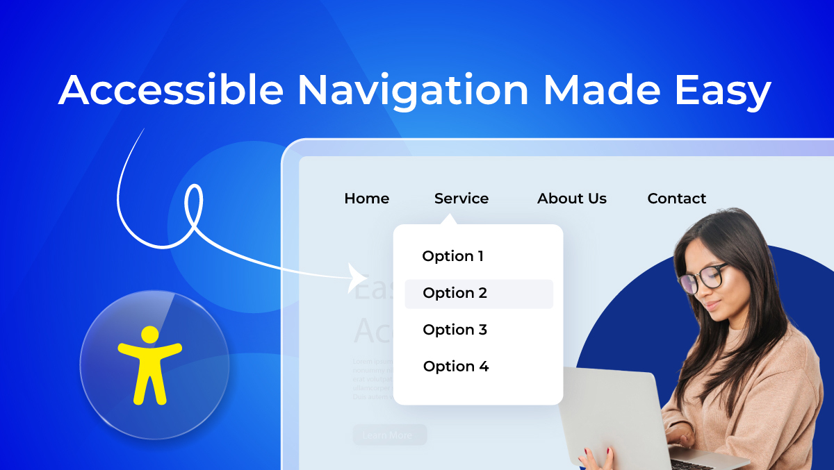
Mega menus and dropdowns are useful tools for grouping a lot of information under one parent link. Although they lessen clutter, improper coding may result in accessibility problems. To keep these menus user-friendly, they must provide keyboard navigation, screen reader compatibility, and distinct hover or focus states.
Hamburger and mobile menus
The choice for Hamburger menu as an option for mobiles is primarily for space saving. However, they hide some important links from view, thereby impairing navigation for some users. For accessible navigation, menu buttons must have clear labels. Large tap targets should be provided, and smooth opening must be ensured by mouse click or through keyboard interaction.
Accessible Menus in Practice
Let's understand Accessible Menus in Practice:
Designing predictable and intuitive menus
Accessible menus ought to always appear familiar. For example, display your primary navigation where customers expect it, in the header, rather than hiding it in strange locations. You want to avoid misunderstanding by using labels that are clear, like "Contact Us," instead of vague ones, like "Get in Touch." Group similar things together under headers like "Products," "Pricing," and "Support" rather than dispersing them across the menu.
Supporting both mouse and keyboard users
Menus ought to be accessible to all users, not just those who have a mouse. For instance, the dropdown menu should appear when you press either the Enter or Space keys, rather than just on hover. A very clear focus outline should be included so users can see where they are while navigating via the Tab key. For example, the keyboard can navigate Amazon's main menu such that each item and submenu can be accessed in a logical order.
Mobile-first design with accessibility in mind
On mobile platforms, make sure menus are thought to be constrained or hard to use. For example, the hamburgers should be larger than 44x44px as per the WCAG standards to allow users an easy tap. Vertical collapsible accordion menus prevail in e-commerce apps like Shopify stores, letting the user expand only the section of interest to avoid overloading. Check that menu text is scaling nicely when the user zooms in so that the layout does not break apart.
Checklist: Design & Development Essentials for Accessible Navigation
Below mentioned are the important points of the Design & Development Checklist for Accessible Navigation:
1. Structure & Hierarchy
Use proper heading levels so screen readers can follow page structure.
<h1>Main Page Title</h1>
<h2>Navigation</h2>
<h3>Subsection</h3>
Keep menus in the same place across all pages for consistency.
Add breadcrumb trails to help users understand their location.
<nav aria-label="Breadcrumb">
<ol>
<li><a href="/">Home</a></li>
<li><a href="/services/">Services</a></li>
<li aria-current="page">Web Accessibility</li>
</ol>
</nav>
2. Menus & Navigation Patterns
Use accessible dropdowns with clear expand/collapse states.
<button aria-expanded="false" aria-controls="menu1">Services</button>
<ul id="menu1" hidden>
<li><a href="/audit/">Accessibility Audit</a></li>
<li><a href="/remediation/">Remediation</a></li>
</ul>
Support full keyboard navigation with Tab and Arrow keys.
Provide a skip navigation link so users can jump to content quickly.
<a href="#maincontent" class="skip-link">Skip to main content</a>
<main id="maincontent">...</main>
3. Links & Buttons
Always use descriptive link text instead of “Click here.”
<a href="/pricing/">View Pricing Plans</a>
Make click or tap targets at least 44x44px for WCAG 2.2.
a, button {
min-width: 44px;
min-height: 44px;
}
Ensure visible hover and focus states for clarity.
a:focus, button:focus {
outline: 3px solid #005fcc;
}
4. Readability & Visuals
Set a minimum font size of 16px for menu items.
Use 1.5 line spacing and adequate padding for readability.
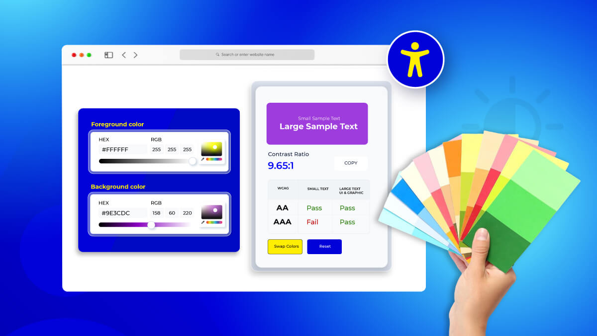
Follow WCAG color contrast guidelines (4.5:1 for text).
body {
color: #222; /* Text */
background: #fff; /* Background */
}
Allow text resizing up to 200% without breaking layouts by using em or rem.
5. Assistive Tech Compatibility
Define navigation landmarks with ARIA roles and labels.
<nav role="navigation" aria-label="Main Menu">
<ul>
<li><a href="/about/">About Us</a></li>
<li><a href="/contact/">Contact</a></li>
</ul>
</nav>
Make menus announce their expanded/collapsed states to screen readers.
button.addEventListener("click", e => {
const expanded = e.target.getAttribute("aria-expanded") === "true";
e.target.setAttribute("aria-expanded", !expanded);
});
Provide alt text for all navigation icons.
<a href="/search">
<img src="search-icon.svg" alt="Search" />
</a>
Label search fields properly for screen readers.
<form role="search" aria-label="Site Search">
<label for="search">Search:</label>
<input type="text" id="search" name="q" />
</form>
Inclusive Content Practices for Navigation
Learn how to make the content inclusive for all through best practices for navigation:
Use plain language in menus and labels
Menus should use clear and simple wording so all users comprehend them at once. For example, use "Contact Us" instead of "Get in Touch" or "Engage With Us". Plain English facilitates readability and navigational efficiency for screen reader users.
Maintain consistent terminology site-wide
Using the same labels across your website avoids confusion. For instance, if you call a section “Resources” on one page, don’t rename it “Learning Center” elsewhere. Consistency supports predictable, accessible navigation.
Provide multilingual support for global users
Websites with an international audience should offer translations or language toggles. For example, a language switcher labeled “EN / DE” ensures users can easily access content in their preferred language.
Add captions and transcripts for linked media
Provide transcripts or captions for any audio or video that is accessed through navigation links. This facilitates access to the information for users who depend on assistive devices or have hearing difficulties. For instance, a "How It Works" video instruction ought to have a transcript that may be downloaded or subtitled.
See our Compliance Hub for detailed requirements on WCAG, EN 301 549, and BFSG compliance in Germany.
Conclusion
Accessible navigation is more than just big buttons and easy-to-read text. It shapes the entire journey, from landing on a page to completing a task. Clear structures benefit everyone, not only people with disabilities. The results include longer visits, smoother movement between sections, and stronger search performance.
The principle is simple: design decisively, code responsibly, and test regularly. Quick overlays and patches may feel convenient, but without thoughtful integration they can be fragile. A genuine, inclusive path is always legible, keyboard-friendly, screen reader compatible, and responsive to any viewport or orientation.
If you’re not sure how your site measures up, a Free Accessibility Audit is a smart way to start. It highlights navigation issues, identifies barriers for users, and gives you actionable steps to improve accessibility in a structured way.
When every page follows inclusive markup, supports keyboard navigation, and aligns with user needs, your site becomes welcoming for all. Keep benchmarks current, listen to feedback, and refine details over time. That way, accessible navigation becomes a lasting part of your website, building a digital space that serves the widest audience today and tomorrow.
FAQs
Accessible navigation ensures that all users, including those with disabilities, can easily move through a website or app. It includes menus, links, and buttons that are easy to locate, understand, and interact with using keyboards, screen readers, or touch devices.
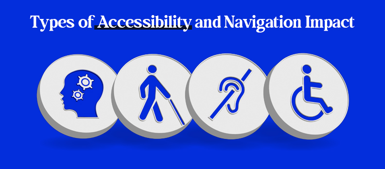
The four main types are:
- Visual – supporting users with low vision or color blindness.
- Auditory – providing captions, transcripts, and alerts.
- Motor – ensuring keyboard navigation and touch-friendly controls.
- Cognitive – using clear language, predictable layouts, and simple interactions.
Accessible navigation includes clear and descriptive labels, predictable menu structures, support for keyboard and screen reader users, proper color contrast, and responsive design for all devices.
Accessible links are descriptive and convey their purpose. For example:
<a href="/pricing">View Pricing Plans</a>
Avoid generic phrases like “Click here,” which do not provide context for assistive technology users.
Navigation is usually placed at the top of the page (header) or in a left-hand sidebar. It should remain consistent across all pages to help users quickly locate menus and access content efficiently.


