The Ultimate Web Accessibility Checklist: Best Practices & Tips
What Is Web Accessibility and Why It’s a Non-Negotiable Today
Make your website accessible to everyone, including people with vision, hearing, mobility, or cognitive disabilities. Accessibility ensures users can navigate without a mouse, use screen readers, and access features on any device.
With over 1.3 billion people (16% of the world) living with disabilities, it’s not just compliance, it’s a way to future-proof your brand and reach a wider audience.
Who Actually Needs an Accessible Website? The Answer May Surprise You
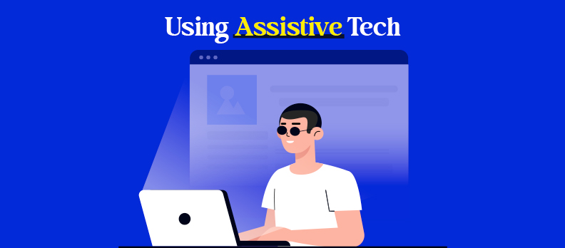
Accessibility benefits everyone, from blind, deaf, mobility-impaired, and neurodiverse users to older adults, mobile users, and people with temporary or situational limitations. Features like captions, readable fonts, keyboard navigation, and alt text improve the experience for all.
In 2025, inclusive design is essential: over 96% of top websites fail basic accessibility checks (WebAIM), excluding millions. Accessible sites attract more visitors, boost SEO, and tap into the $8 trillion global spending power of disabled users (The Valuable 500).
Making your site accessible builds trust, drives engagement, and future-proofs your brand. It’s both the right choice and smart business.
Don’t Wait for a Lawsuit to Start Caring About Accessibility
Legal compliance is a key motivator for web accessibility. In the USA, the Americans with Disabilities Act (ADA) applies to websites, especially for businesses that provide goods or services to the public. Other global laws are:
- EN 301 549 (European Union)
- Accessibility for Ontarians with Disabilities Act (AODA)
- UK Equality Act 2010
For a deeper understanding of ADA, WCAG, and other requirements, visit our Compliance Hub.
Just in 2023, there were more than 4,600 ADA web accessibility lawsuits that were filed in the federal courts (HubSpot User Content). The majority of complaints targeted retail, hospitality and education websites.
Accessibility is no longer optional; it's the law in many areas.
The 4 Key Accessibility Principles Every Website Must Follow
Web accessibility is underpinned by a framework of four guiding principles known as POUR. The framework is defined by the Web Content Accessibility Guidelines (WCAG), which is the worldwide standard for digital accessibility.
Each principle ensures your website is usable by people with different kinds of disabilities.
- P – Perceivable: Content should be visible or audible. Add alt text, maintain color contrast, and provide captions/transcripts.
- O – Operable: Usable without a mouse. Enable full keyboard access, clear focus indicators, and avoid traps.
- U – Understandable: Easy to read and navigate. Use plain language, consistent menus, and helpful error messages.
- R – Robust: Compatible with assistive tech on all devices. Use clean HTML, proper ARIA, and support desktop/mobile.
These four principles provide the backbone to compliance with WCAG (W3C, WCAG 2.2) and will support you in making every accessibility decision.
Semantic HTML and ARIA: Your Code Matters More Than You Think
Using the right HTML elements makes your content easier to access, especially for screen readers.
Semantic HTML means:
- Using <nav> for menus
- Using <header>, <main>, and <footer> for layout
- Using <button> instead of clickable <div>s
These elements give structure to your page and make it easier for assistive technologies to interpret.
ARIA (Accessible Rich Internet Applications) attributes add meaning when native HTML isn't enough.
Use ARIA to:
- Label complex widgets
- Announce dynamic content
- Describe roles, states, and properties
But caution: ARIA should enhance, not replace semantic HTML. Incorrect ARIA use can make accessibility worse.
Always start with clean, semantic code, then layer ARIA carefully where needed (MDN ARIA Guide).
Accessibility Standards and Guidelines You Need to Know
The Web Content Accessibility Guidelines (WCAG), published by the W3C, set global standards for accessible websites. The latest version, WCAG 2.2 (Oct 2023), adds updates like visible focus indicators, drag-and-drop alternatives, consistent help options, and minimum touch target sizes.
WCAG follows the POUR principles: Perceivable, Operable, Understandable, Robust, with three conformance levels:
- A: Basic requirements
- AA: Legal and industry standard
- AAA: Highest, rare level
You can explore WCAG in detail at WCAG Accessibility Guide
ADA, Section 508, and International Accessibility Laws
In the context of digital accessibility, in addition to WCAG, there are many regional or local laws against discrimination. Depending on your audience or business type, you may be required to comply under the law.
The most common laws that apply include the following:
United States
- Americans with Disabilities Act (ADA): Requires businesses and public web sites to be equally accessible. Title III has been the basis of thousands of lawsuits in the area of web accessibility.
- Section 508 of the Rehabilitation Act: Applies to federal agencies and contractors. Requires compliance with WCAG 2.0 AA at minimum.
European Union
- European Accessibility Act (EAA): The EAA applies to remanufactured parts (ecommerce), banking, transport, and public sector websites and apps. The EAA also is based on EN 301 549 (which mirrors WCAG).
- EU Web Accessibility Directive: The Directive only applies to public sector websites and app accessibility.
Canada
- Accessible Canada Act (ACA): Federal level legislation requiring digital accessibility.
- AODA (Ontario): All public and private organizations must meet at a minimum WCAG 2.0 Level AA content for digital accessibility
United Kingdom
- Equality Act 2010: Operators must make reasonable adjustments to provide equivalent services to users who have a disability in their digital services. Government agencies and authorities must comply with WCAG to the level of AA (even higher standard required under the Public Sector Bodies Accessibility Regulations 2018).
Explore our ADA: Advanced Guide to Accessibility and Design to know more about ADA compliance.
Why These Standards Matter
Following accessibility standards is not just about avoiding legal issues. It ensures:
- Equal access to information
- A better user experience for all
- Stronger SEO and user retention
- Future-ready, scalable websites
Whether your site serves a global audience or a local community, aligning with accessibility standards is the right move for long-term success.
Common Accessibility Barriers You Should Avoid Today
Accessibility barriers prevent millions from fully using your website. They frustrate users, limit your audience reach, and can put you at risk of legal issues. Eliminating these barriers improves user experience, boosts SEO, and builds trust with all visitors.
1. Poor Visual Design
Why it’s a problem: Low contrast, tiny fonts, or cluttered layouts make content unreadable for users with visual impairments. Over 4.2 million U.S. adults over 40 have some vision loss (CDC).
How to fix:
- Maintain at least 4.5:1 contrast for body text.
- Use readable sans-serif fonts (minimum 16px).
- Avoid using color alone to convey meaning.
- Keep layouts clean with adequate white space.
2. Keyboard & Navigation Barriers
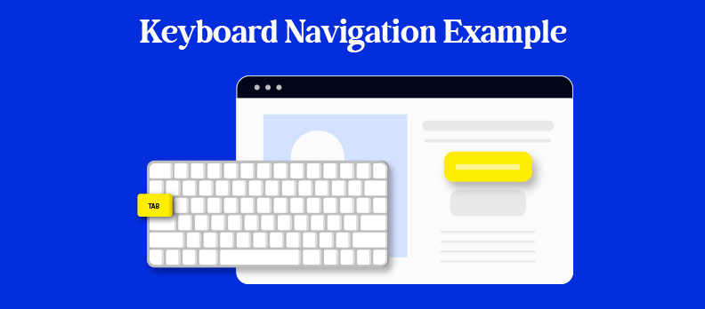
Why it’s a problem: Many users with motor or vision impairments rely solely on keyboards or assistive devices. If your site can’t be fully navigated without a mouse, it’s inaccessible.
How to fix:
- Make all interactive elements reachable via keyboard.
- Maintain a logical tab order.
- Provide a visible focus indicator.
- Avoid focus traps in modals or interactive elements.
3. Missing Captions & Transcripts
Why it’s a problem: Without captions or transcripts, videos and audio exclude 430+ million people with hearing loss (WHO) and anyone in noisy environments.
How to fix:
- Provide accurate captions for all videos.
- Offer transcripts for audio and podcasts.
- Add audio descriptions for visual-only video elements.
- Ensure media players are keyboard-accessible.
4. Additional Barriers to Watch For
- Missing Alt Text: Screen reader users can’t understand images without descriptive alt text.
- Inconsistent Layouts: Causes confusion, especially for users with cognitive disabilities.
- Small Click Targets: Difficult for mobile users and those with limited motor skills.
- Time Limits Without Extension: Can lock out slow readers or people with attention challenges.
Web Accessibility Checklist: What You Need to Know in 2025
Building an accessible website isn’t just about compliance, it’s about creating a digital space that everyone can use. This ultimate checklist breaks down 7 core areas to help you build or improve accessibility on your site. Each point includes practical guidance and examples for real-world application.
1. Add Clear, Descriptive Alt Text to All Images
Alt text ("alternative text") gives a written description of images, so screen readers can communicate what is on the page to blind or visually impaired users. Without alt text, the image may be announced by a screen reader as "image" or "graphic" meaning nothing to the user.
Best Practices:
- Include a description of the content and function of the image, such as "Download button with arrow pointed down.
- Be consistent, but also as succinct as possible! Don't write "logo," say "XYZ company logo" when the distinction is meaningful.
- If you are using an image as decoration and nothing else, use empty alt text (alt="") so the screen readers will ignore it.
Example:
For an image of a person in a wheelchair using a computer in a café:
- Bad alt: "image1.jpg"
- Good alt: "A man in a wheelchair uses a computer at a café table."
This is not only helpful for screen reader users, but also for search engine optimization, as search engines index alt text.
2. Make Your Website Fully Navigable via Keyboard, Screen Readers, and Voice Commands
Many users are using a keyboard or a screen reader or voice-controlled technology to do so. For example, someone with a motor disability may only have access to the Tab key and Enter key to navigate a page.
Checklist:
- Every interactive item (menus, buttons, links, forms) must be usable with only a keyboard.
- Focus indicators (i.e., outlines on the selected items) must be visible.
- Do not use mouse-only features, like hover navigation, without an alternative.
- When testing for screen reader compatibility, ensure the order is logically read and label descriptions are present.
Example:
Think about a dropdown menu for an anchor item that is supposed to appear on hover of a mouse. A keyboard user will never be able to access it. This would prevent them from navigating their pages and is a huge barrier.
3. Include Captions and Transcripts for Audio and Video Content
Multimedia materials should never exclude users with hearing or visual disabilities. The use of captions and transcripts allows everyone to access and understand the content you create.
What to include:
- Closed captions for live and archived video material
- Transcript for podcast or any other audio content
- Audio description for scenes in video where there is important information suggested by visual context
You may ask,
A product demonstration video that provides no captions is inaccessible for anyone who is deaf and does not have the use of sound (in noisy environments). A transcript allows all users to find content quickly, reference it later or utilize it with assistive screen reading technology.
Captions also benefit users who are non-native speakers or prefer to read along while watching.
4. Run Regular Automated Accessibility Scans to Catch Issues Early
Automated tools will crawl your website and find you hundreds of accessibility violations, from missing alt text to low contrasts.
Why does this matter?
- The web is constantly changing and accessibility can easily break after updates.
- Automated tools can help quickly surface gaps in compliance.
- You can set up scans routinely to proactively deal with issues before they become part of a legal risk.
For example:
Let's say a blog team adds a band new sidebar widget with bright yellow text on a white background. An automated scan flags this as a contrast issue - giving the team a chance to address the problem before users complain or bounce.
5. Combine Manual and AI-Powered Audits for Complete Coverage
Automation can be useful, but it will not take the place of human judgment. Human Audit, while less efficient than an automated process, will evaluate useability in the real world, for example, if the user can follow confusing language in the form instructions, and if the user interacts with the content as it should (i.e., using the content order that a screen reader will use).
Human testing can check:
- Logical reading flow/headings structure
- Usability of forms and navigation
- Compatibility with real assistive technologies (those technologies being screen reader, eye tracking, etc.)
- Emotional tone, thry it is the meaning, and usability of interactions
Example:
An AI tool will likely miss the fact the error message disappears before the screen reader pronounces it. However, a human will catch this error and guide a better design process.
Using these two methods together, AI for scale, and human for accuracy, you can establish a robust accessibility process.
6. Use High Color Contrast, Scalable Text, and Legible Fonts
Design decisions can help or hinder accessibility.... Imagine the negative influence of low contrast, small point sizes, and decorative typography - these can all make it exceedingly difficult for users who have low vision or dyslexia to comprehend the content.
Accessibility specifications:
- WCAG provides a test for contrast ratio as:
- Normal text = at least a 4.5:1
- Large text = at least a 3:1
- Text must be resizable to a minimum of 200% without loss of content or function.
Use simple, sans serif fonts such as Arial, Helvetica or Verdana.
Consider this example:
A landing page uses light gray text on a white background to look 'modern' - unfortunately, it creates a horrible experience for users with low vision and readers with color blindness! Fixing the contrast ratio alone, will remedy the users problem instantly.
Also, they should not be able to zoom in but cut off content or break the site layout!
7. Make Forms Easy to Complete and Submit
Poorly designed forms can become massive roadblocks for users with disabilities. Labels that aren’t connected to inputs, buttons that can’t be tabbed to, and confusing error messages create frustration and lost conversions.
Checklist for accessible forms:
- Use clear, persistent labels for all form fields.
- Group related fields logically (like first and last name).
- Provide meaningful error messages and success confirmations.
- Ensure every field can be accessed and submitted with just a keyboard.
Example:
A donation form that resets after an error, without telling the user what went wrong, causes confusion and drop-offs. A better version would highlight the missing fields, keep the data intact, and announce success when submitted.
Accessibility isn't just a technical task, it’s a mindset. Every enhancement you make improves usability, opens your digital space to a broader audience, and protects you legally. This checklist is your starting point. Use it regularly, and continue learning as your website evolves.
Tools for Testing and Auditing Accessibility
Don't have to guess if your site meets accessibility standards or not. There are many reputable tools that will help you check, test and verify your efforts.
Here are just a few of the best options:
- WAVE from WebAIM: Reports issues directly on the page
- axe DevTools: Chrome extension that includes automated WCAG testing
- Lighthouse (built in Chrome DevTools): This gives an accessibility score
- NVDA and VoiceOver: free screen readers. Their use gives you an actual usability test
- Access Audit: An AI-powered auditing tool that surfaces common accessibility issues early and helps teams prioritize fixes during real browsing sessions.
To ensure your accessibility remains robust over time, we also recommend integrating these specialized solutions:
- Access Monitor: A continuous monitoring platform that tracks accessibility changes over time and helps prevent regressions after updates.
- Access Widget: A user-facing accessibility widget that allows visitors to adjust contrast, text size, and visual settings for immediate usability.
- Access Accy: An AI accessibility assistant that helps guide users to accessible content, controls, and navigation paths.
- Access Services: Expert support for audits, remediation planning, training, and long-term accessibility strategy when deeper guidance is needed.
Also, it's important to use both auto testing, and manual testing. It's what has been identified that automation measures can only catch 30% of issues, the other 70% must be visually and manually reviewed.
Have questions? The Accesstive Help Center has answers to common accessibility issues and troubleshooting tips.
Real-World Accessibility Examples That Set the Standard
There is no better way to learn about accessibility than to see it in action. There are several brands that have made accessibility a part of their digital experience.
1. BBC
The BBC's website is built upon inclusive design principles. It features semantic HTML, high contrast, keyboard friendly navigation, and descriptive alt text on images and graphics.
2. Apple
The accessibility section on its website provides user-first navigation, readable design, and well written alt text. Apple uses consistent UX across its devices to enhance user experience for keyboard users as well as screen reader users.
3. GOV.UK
The gov.uk website is cited often as the quintessential model for accessibility. It is built with design principles that include: clear structure, concise and clear language (readability), and W3C WCAG 2.1 AA compliance.
All of these examples demonstrate that accessibility is achievable at any size - and it can even lead to more visually pleasing design and enhanced brand trust.
What Lawsuits Can Teach Us About Inaccessible Websites
Accessibility lawsuits have become more common, and they offer clear lessons for what to avoid.
1. Domino’s Pizza (2019)
A blind user sued Domino’s after being unable to order through its website using a screen reader. The case went to the Supreme Court, which allowed the lawsuit to proceed under the ADA.
Lesson: Your website must be operable with assistive tech, even if you also have a mobile app.
2. Target (2006)
Target paid $6 million after a class-action lawsuit by the National Federation of the Blind. The site was redesigned to meet accessibility guidelines. Source: The New york Times
Lesson: Ignoring accessibility can cost millions, proactive design is much cheaper.
Getting Started with Accessibility: A Practical Guide
Accessibility works best when it’s not treated as a one-time fix but as part of your ongoing process. By making it a habit, your team can build inclusive experiences from the start instead of patching problems later.
Here’s how to integrate it into your workflow:
- Design phase: Start using accessible components and check for color contrast early on
- Development phase: Write clean semantic HTML and test with screen readers
- Content phase: Use plain language, structure with headings, and write valuable alt text
- QA phase: Test keyboard access, forms, and responsive design on each device
At this stage, it’s helpful to run your site through our Free Accessibility Checker. It will instantly spot common issues and provide clear, actionable fixes that you can address before moving forward.
- Launch phase: Run accessibility audits and user tests
By weaving accessibility into every stage of your workflow, you’ll create better products, strengthen SEO, expand your audience, and reduce legal risks for your brand.
FAQs
Web accessibility means designing websites usable by people with disabilities, including vision, hearing, motor, and cognitive impairments. Over 1.3 billion people worldwide have a disability (WHO). Accessible sites ensure equal access, better usability, and legal compliance.
The Web Content Accessibility Guidelines (WCAG) by the W3C’s WAI set global rules based on the POUR principles: Perceivable, Operable, Understandable, Robust.
Yes, in many countries. Examples:
- US: ADA, Section 508
- UK: Equality Act 2010
EU: European Accessibility Act, EN 301 549
Noncompliance risks lawsuits, fines, and reputational damage.
Testing checks if a site meets accessibility standards via automated tools (axe, WAVE, Lighthouse), manual keyboard/screen reader tests, and user feedback with assistive tech.
A full WCAG compliance review including code analysis, manual tests, and a prioritized fix plan. Can be internal or by third-party experts.
Provide descriptive alt text for meaningful images, empty alt for decorative ones, and long descriptions for complex visuals. This supports screen reader users and improves SEO.
Not just disabled users, also older adults, mobile users, people in noisy/bright settings, those with temporary injuries, and non-native speakers. Accessibility improves usability for all.

