A Guide To Keyboard Accessibility: HTML And CSS
Why Keyboard Testing Matters
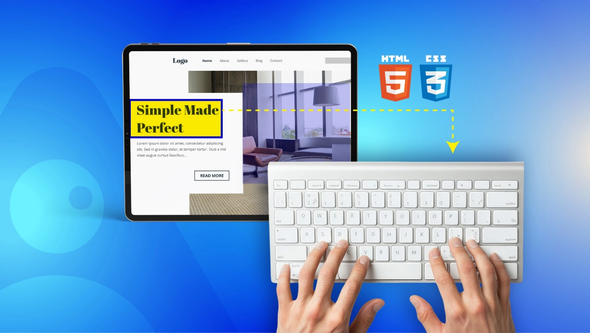
By testing your website for overall keyboard accessibility, you will ensure it functions properly for individuals who cannot (due to an impairment) or do not like (due to a preference) using a mouse. Testing for keyboard accessibility is a fundamental requirement of the Web Content Accessibility Guidelines (WCAG) and can affect both legal obligations as well as user satisfaction.
Legal and Usability Advantages
Keyboard accessibility is a WCAG 2.2 Level A requirement (W3C). In many countries, such as the United States (under the ADA) and in the EU (under the European Accessibility Act), not adhering to these standards may lead to lawsuits and/or levying of fines.
From a usability perspective, good keyboard support also makes it easier for everyone, including power users who like to use keyboard shortcuts and individuals using devices without accurate pointing tools.
More logical tab orders, visible focus indicators, and functional interactive elements all help to accomplish easier navigation and user satisfaction at higher levels.
Who Needs Keyboard Navigation?
Many people depend on a keyboard or other alternative input device instead of a mouse, including:
- Users with motor disabilities who cannot use a mouse
- Screen reader users (often, but not always, blind and visually impaired) who navigate their computer via keyboard commands (WebAIM)
- People with repetitive strain injuries (RSI) who avoid using a mouse for health reasons
- Users of assistive technology like sip-and-puff devices or switch controls
These users may have a difficult time interacting with your website without any proper keyboard testing, which means missed opportunities for engagement, conversions, and trust.
WCAG Keyboard Requirements
The Web Content Accessibility Guidelines (WCAG) outline clear rules to ensure websites are usable without a mouse. Meeting these requirements not only improves accessibility but also reduces legal risk and enhances the experience for all users.
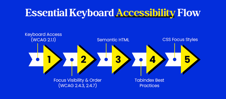
2.1.1 (Keyboard Access)
WCAG 2.1.1 requires that all functionality must be operable through a keyboard interface without requiring specific timings for keystrokes (W3C WCAG 2.2).
What this means in practice:
- Each interactive element (links, buttons, form fields, menus) must be reachable by the Tab, Shift+Tab, Enter, and Space keys.
- Users must be able to activate all controls and complete all tasks via keyboard only.
- Drag-and-drop actions need keyboard friendly alternatives (new requirement in WCAG 2.2).
Failing to meet this standard can create keyboard traps, where a user cannot escape a certain section or component, a major barrier for assistive technology users.
Focus Visibility & Order
WCAG 2.4.3 (Focus Order) and 2.4.7 (Focus Visible) require that focus indicators are clearly visible and follow a logical sequence (W3C WCAG 2.2).
Best practices include:
- Make the use of a high-contrasted outline or style for the active item so that users always know where they are on the page.
- Follow the visual reading order with the tab order so that the tabbing sequence makes sense to the user.
- Avoid using hidden or off-screen elements that receive focus.
A consistent, visible focus path ensures users can navigate confidently and complete tasks without getting lost, critical for users who rely entirely on keyboard navigation or assistive tech.
HTML Must-Dos
Good keyboard accessibility starts with clean, semantic HTML. Proper markup ensures browsers and assistive technologies can interpret your content correctly, making navigation predictable and efficient.
Semantic Elements
Using semantic HTML elements, like <nav>, <main>, <header>, <footer>, <button>, and <form>, gives structure and meaning to your page (MDN Web Docs).
Benefits include:
- Automatic keyboard support for native elements without extra scripting.
- Better screen reader interpretation, as semantic elements carry built-in roles and behaviors.
- Improved SEO, since search engines also use semantic clues to understand page structure.
Avoid replacing standard elements with non-semantic <div> or <span> tags for interactive components, as these require extra ARIA roles and keyboard handling that’s often implemented incorrectly.
Proper tabindex Use
The tabindex attribute controls the order in which elements receive keyboard focus. When misused, it can cause confusing or inaccessible navigation.
Best practices:
- Use tabindex="0" to make a custom element part of the normal tab sequence.
- Use tabindex="-1" for elements that should be focusable only programmatically (e.g., for modal dialogs).
- Avoid positive tabindex values (tabindex="1", 2, etc.), they create unnatural focus jumps and break expected order.
- Ensure your DOM order matches the visual order, so users tab through the page logically.
Following these HTML basics minimizes the need for complex scripting and reduces accessibility errors that can block keyboard users entirely.
CSS Focus Styles
Proper CSS focus styles are critical for helping keyboard users track their position on a page. Removing or hiding focus indicators is one of the most common, and damaging, accessibility mistakes.
Visible Focus Indicators
WCAG 2.4.7 (Focus Visible) requires that keyboard users can clearly see which element is active (W3C WCAG 2.2).
Best practices for visible focus indicators include:
- Using a high contrast outline or changing the background for focused elements.
- You can remove outlines using outline: none; but not before viewing the outline change for an equally visible indicator.
- Be aware that focus styles work in high contrast mode as well and on all devices.
Even sighted mouse users benefit from focus styles when switching between mouse and keyboard navigation.
:focus-visible Implementation
The :focus-visible pseudo-class shows focus indicators only when the user navigates via keyboard (or similar methods), avoiding unwanted outlines for mouse clicks (MDN Web Docs).
Example:
button:focus-visible {

outline: 3px solid #005fcc;

outline-offset: 2px;

}
This approach improves usability by keeping focus cues for keyboard users without cluttering the interface for mouse users.
Testing Checklist
Before considering your site keyboard-accessible, run through this simple test.
Can you access everything?
- Utilize only Tab, Shift+Tab, Enter, Space, and the arrow keys.
- Verify that all links, buttons, menus, and forms can be accessed and activated.
- Confirm that modals, dropdowns, and any other interactive elements work without a mouse.
Are there keyboard traps?
- You should be able to move back and forth with Tab/Shift+Tab at all times.
- You should be able to exit any modal or dialog by pressing the Esc key or tabbing back to the main content.
- Test with screen readers to make sure that no component traps focus unexpectedly.
If you fail any step in this checklist, your site may block users who rely entirely on keyboard navigation, a serious accessibility and legal risk.
Fixing Common Issues
Many keyboard accessibility problems come from common coding shortcuts or omissions. Fixing these not only improves accessibility but also makes maintenance easier.
Clickable <div> → <button>
Developers often use <div> or <span> elements with click handlers for interactive features. These are not keyboard-accessible by default and require extra scripting to work with Enter or Space.
Preferred approach:
- Replace them with semantic elements, and they will be natively focusable and keyboard-operable.
- Buttons also provide default accessibility roles, states, and behaviors so that there is no need to author custom ARIA attributes.
Missing Skip Links
A skip link lets users bypass repetitive content (like navigation menus) and jump directly to the main content. This is especially important for screen reader and keyboard users.
Best practice:
- Add a visible-on-focus <a href="#main-content">Skip to main content</a> link at the top of the page.
- Ensure it works with both keyboard and screen readers.
Advanced Components
Complex UI components like modals, menus, and sliders often require additional accessibility work to be fully usable with a keyboard.
ARIA for Modals/Menus
ARIA (Accessible Rich Internet Applications) attributes help define roles, states, and relationships for assistive technologies.
For modals:
- Use role="dialog" and aria-modal="true".
- Trap focus within the modal while it’s open and return focus to the trigger element when closed.
For menus:
- Use role="menu" and role="menuitem" where appropriate.
- Manage focus movement with arrow keys according to ARIA menu guidelines.
Custom Keyboard Controls
For custom components (e.g., sliders, carousels, accordions), define intuitive keyboard controls:
- Arrow keys for horizontal/vertical movement.
- Enter or Space for activation.
- Esc to close popups or menus.
Always follow ARIA Authoring Practices for the component type and test with both keyboard and screen readers to confirm expected behavior.
Tools & Resources
The right tools make testing and improving keyboard accessibility faster and more reliable. Here are some trusted options used by accessibility professionals.
- Lighthouse – A built-in Chrome DevTools audit tool that checks accessibility alongside performance, SEO, and best practices.
- Access Audit – An AI-powered accessibility review that provides prioritized fixes, best practice recommendations, and WCAG compliance insights.
- Access Monitor – Tracks your website’s accessibility over time, alerts you about new issues, and supports continuous WCAG compliance.
- Access Widget: A user-facing tool that allows visitors to immediately adjust visual and keyboard navigation settings to improve usability.
- Access Accy: An AI accessibility assistant that helps guide users to accessible content, controls, and navigation paths.
- Access Services: Expert support for audits, remediation planning, and long-term accessibility strategy when deeper guidance is needed.
These tools are tailored for website owners and developers who want fast, actionable insights without complex setup.
Conclusion
Keyboard accessibility is not just a compliance item; it is an essential step in providing an inclusive, easy to use web experience.
By using WCAG Guidelines, applying semantic HTML, providing visible focus states, and testing regularly, you can ensure that your website is usable for the millions of people who use keyboard navigation only.
Improving accessibility, as a general rule, benefits every user (e.g., power users who rely on keyboard shortcuts, users with a temporary impairments or situational limitations, etc.). Even small fixes, like including skip links or fixing the tab order of your links, can improve your usability.
Start improving your site today. Use Accesstive’s Free Accessibility Checker to instantly scan for WCAG issues, identify problem areas, and get actionable fixes. A more accessible site is just one click away.
FAQs
Keyboard accessibility ensures that people who cannot use a mouse, including users with motor disabilities, screen reader users, and power users, can fully navigate and interact with your website. It’s a WCAG requirement and improves usability for everyone.
Most operating systems have accessibility settings. On Windows, go to Settings → Accessibility → Keyboard and enable options like Sticky Keys or Filter Keys. On macOS, open System Settings → Accessibility → Keyboard and turn on “Full Keyboard Access.”
Use semantic HTML elements (<button>, <a>, <form>) so they’re naturally keyboard focusable. Ensure visible focus styles, logical tab order, and no keyboard traps. Test with just your keyboard, you should be able to reach every interactive element.
Unplug your mouse and use Tab, Shift+Tab, Enter, Space, and arrow keys to navigate. Check if all elements can be reached, activated, and exited. Tools like axe, Lighthouse, and Accesstive’s Accessibility Checker can automate part of the process.
In browsers, press Alt + Left Arrow (Windows) or Command + Left Arrow (Mac) to go back to the previous page. Some laptops may require the Fn key as well.
On macOS, Control + Option + D toggles the Dock’s visibility. On Windows, this shortcut can vary depending on installed apps, so it’s not universal.


