Designing Accessible Forms: Best Practices for UX & Compliance

Forms can be found everywhere. From signup pages to checkout flows and surveys, forms can be challenging to use and often lead to frustration or a block for many users.
Accessible forms could change that. They create a different experience and allow everyone (including disabled individuals) to complete tasks efficiently and confidently.
Accessible forms are not just ethical; they are smart design. They provide a better user experience, lower error rates, increase conversion rates, and help align with technical standards like WCAG, which supports your overall ADA strategy.
In this guide, we will provide you with the knowledge to design intuitive, inclusive, and compliant forms, with practical tips, code examples, and checklists to create forms that work for all users.
Let's dive in!
Understanding Form Accessibility
When we refer to form accessibility, we are talking about making it usable for everyone, regardless of ability, device, or context. An accessible form does not mean it is only usable for individuals with disabilities, but a clearer and easier experience for all users.
Who Benefits from Accessible Forms?
- People who are blind or have low vision, use screen readers, or require a strong color contrast.
- People with motor disabilities who navigate by keyboard instead of a mouse.
- Individuals with cognitive or learning disabilities benefit from strong labels and clear messages when there are errors.
- Older adults may have vision, hearing, or dexterity loss.
Accessibility Standards to Know
There are a variety of guidelines and laws that factor into how forms should be made accessible.
- WCAG 2.2 (Web Content Accessibility Guidelines) - The global standard for the accessibility of everything digital.
- Section 508 (US) - Mandates that federal agencies must make digital content accessible.
- ADA (Americans with Disabilities Act) - Ensures equal access to all online services in the US, regardless of disability.
- EN 301 549 (EU) - Accessibility requirements for all European ICT Products and Services.
Accessibility vs. Usability
Keep in mind the difference:
- Accessibility allows people with disabilities to interact with your form.
- Usability allows everyone an efficient and enjoyable experience.
An accessible and inclusive form does both.
Core Principles of Accessible Form Design
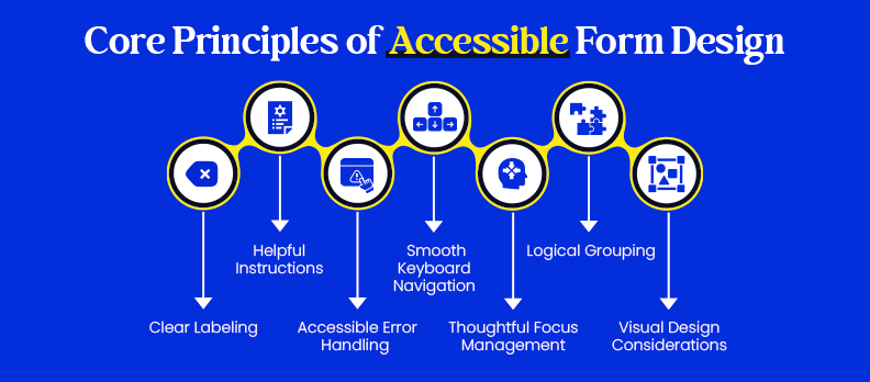
There are a few fundamental principles behind accessible form design. These principles inform how labels, instructions, navigation, and visual design should be combined so users can fill out the form without confusion or barriers.
1. Clear Labeling
- Every field should have a label that defines the required information.
- Link the label to the input with the for and id attributes so screen readers can read both together.
Example of good practice:
 <label for="email">Email address</label>
 <input type="email" id="email" name="email" required>
- Do not use placeholder text as the only label; once the user clicks into the field, the label is gone.
2. Helpful Instructions
- If instructions are needed, keep them simple and straightforward. Include them especially for required fields or special input formats (e.g., "Passwords must contain at least eight characters").
- Place them next to the field you are referencing, so they are not overlooked.
3. Accessible Error Handling
- Use specific error messages, such as "Please enter a valid email address," instead of non-descriptive phrases like "Invalid input."
- Errors should be announced to users via a screen reader with ARIA attributes, such as aria-describedby or a live region.
- Errors can have real-time validation and/or a summary presented at the time of submission.
4. Smooth Keyboard Navigation
- Keyboard-only users must be able to access and interact with all form elements.
- Implement a logical tab order that adheres to the visual structure of the form.
- Display visible focus to let the user know where they are on the page.
5. Thoughtful Focus Management
- If a form error occurs, focus on the first error or make the summary of errors at the top of the form clear and concise.
- In multi-step forms, make sure users can move focus to the next section without trapping them.
6. Logical Grouping
- Use <fieldset> and <legend> to logically group related means of input. (e.g., a set of radio buttons for “Payment Method.”)
- This gives context to screen readers and lets users understand fields that have a relationship with each other.
7. Visual Design Considerations
- Ensure sufficient contrast with colors, text, inputs, and background surfaces (instead of 4.5:1 for normal text under WCAG).
- Do not rely solely on colors to show errors or requirement designations; you can also add symbols or text.
- Leave sufficient whitespace around buttons and form inputs to make clicking or tapping easy in mobile use.
Technical Implementation for Accessible Form
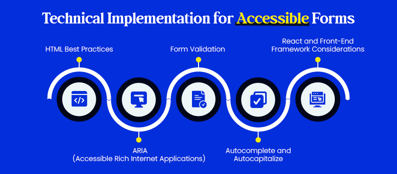
Design standards do provide a solid foundation, but technical decisions related to form accessibility will determine whether the form is actually usable. We can ensure that forms are functional across assistive technologies and devices using semantic HTML, thoughtful ARIA, and proper validation.
1. HTML Best Practices
- Use semantic elements: <form>, <label>, <fieldset>, <legend>, and <input> instead of generic <div>s.
- Use the correct input types (email, number, tel, date) so that users can use the right keyboard, and assistive tools can help them.
- Use the required attribute to mark required fields, and where it's possible, explicitly indicate optional fields.
- Example:
<form>
<label for="phone">Phone number (optional)</label>
<input type="tel" id="phone" name="phone">
</form>
2. ARIA (Accessible Rich Internet Applications)
- Use ARIA only when semantic HTML is insufficient.
- Common attributes:
- aria-required="true" for mandatory fields.
- aria-invalid="true" when input contains an error.
- aria-describedby="error-msg" to connect a field with an error message.
- Avoid overusing ARIA, since it can be confusing if misapplied.
- Example with ARIA:
<label for="username">Username</label>
<input type="text" id="username" name="username" aria-required="true" aria-describedby="username-help">
<span id="username-help">Choose a unique username, at least 6 characters long.</span>
3. Form Validation
- Always provide server validation as a fallback, because client scripts may fail or be disabled.
- Use the built-in HTML5 validation (required, pattern, type) whenever possible.
- If using JavaScript for customized validation, announce errors in ARIA live regions.
- Example with live region:
<div aria-live="polite" id="error-summary"></div>
4. Autocomplete and Autocapitalize
- Using autocomplete is meant to assist users in filling in common fields quicker (e.g., autocomplete="email" or autocomplete="street-address").
- This helps save time and reduces the chance of typos, especially on mobile.
- Example:
<label for="address">Street Address</label>
<input type="text" id="address" name="address" autocomplete="street-address">
5. React and Front-End Framework Considerations
- If using React or other frameworks, confirm that controlled components expose appropriate relationship IDs.
- Control focus changes manually on single-page applications, especially after form submission or error conditions.
- Libraries such as Formik and Yup can extend their purpose with ARIA attributes and custom error management, all to support better accessibility.
Testing Accessible Forms
Even a well-constructed form is worthless if not properly tested. Form accessibility testing involves testing the form both manually and with automated tools.
1. Automated Testing Tools
- Lighthouse (in Chrome Dev Tools): Performs quick checks of color contrast, labels, and elements about the form.
- axe (Deque): Browser extension that scans a webpage for issues thoroughly with accessibility standards.
- WAVE (WebAIM): Highlights errors and provides alerts directly on the page.
- Deque WorldSpace/axe DevTools Pro: Enterprise-level application that works with teams.
Automated testing tools are effective for identifying detectable code-level issues or incorrect ARIA usage. Tools like Access Widget and Access Audit help teams identify and prioritize remediation for common technical barriers.
However, automated testing typically uncovers only about 30–40% of accessibility issues, which is why manual testing remains essential.
2. Manual Testing
- Keyboard only: Attempt to complete the form without a mouse, see if you can access all fields, have a clear, focused item, and be able to submit it.
- Screen reader testing: Use a tool such as NVDA (Windows), JAWS (Windows), or VoiceOver (macOS/iOS) to check the script; make sure the screen reader announces the labels, instructions, and any errors.
- Mobile: To ensure the form is usable, use a native screen reader on Android (TalkBack) or iOS (VoiceOver).
To ensure these improvements remain intact over time, Access Monitor can help teams track accessibility changes after releases and updates.
3. Checklists and Audits
- You should also keep a checklist of key requirements for accessibility based on the requirements of the form: labels, grouping, errors, focus, and keyboard access.
- Audit existing forms, especially if they have just undergone a design and/or code change.
- Offering a downloadable checklist can help design and development teams stay consistent.
Solutions like Access Accy support consistency by helping teams maintain accessible content practices over time, while Access Services can assist with structured audits, expert validation, and remediation guidance when deeper review is required.
WCAG Mapping and Compliance
Creating accessible forms isn't just good UX; it's also about complying with established accessibility standards and legal requirements. The internationally recognized benchmark is the Web Content Accessibility Guidelines (WCAG), which many local laws directly reference.
Common Issues with Forms and Movement to the WCAG:
- Labels → [WCAG 4.1.2: Name, Role, Value]
Each form field must have a WCAG forms label programmatically associated with the field for assistive technologies to announce it correctly. - Error Identification → [WCAG 3.3.1: Error Identification]
If input is invalid, that error must be described in text. - Instructions → [WCAG 3.3.2: Labels or Instructions]
Users should be clearly informed about how to complete fields (ex., the required format for dates). - Focus Order → [WCAG 2.4.3: Focus Order]
Users using a keyboard should navigate to fields in a logical and sequential order.
Regional Legal Frameworks:
- United States
- The ADA (Americans with Disabilities Act) is increasingly being interpreted to apply to websites and online services.
- Section 508: requires federal and state agencies and contractors to ensure accessibility in the digital content they use.
- European Union
- The EU Accessibility Act and EN 301 549 are criteria for ICT products and services (including web forms).
- United Kingdom
- Public Sector Bodies Accessibility Regulations: make public sector websites and apps comply with WCAG 2.1 AA.
Conclusion
Accessible forms are compliant and help create a better user experience. Clear labels and instructions, logical focus order, and accessible error handling make forms easier to fill out and more successful in converting users.
The good news is that accessibility does not have to mean complexity. By following best practices, utilizing semantic HTML, and testing with real users and assistive tools, you can build accessible forms, meet standards, and make it easy for the user.
To simplify, you can start by running your site through a free accessibility checker. This tool provides a quick view of common issues and can help improve your forms immediately.
FAQs:
An accessible form has clear labels and instructions and provides a logical focus order. These error messages can be interpreted by assistive technologies and utilized via keyboard and screen readers.
Accessible forms allow people with disabilities to complete tasks independently. They also improve the usability of forms for all individuals and assist organizations in complying with legal initiatives such as WCAG, ADA, and Section 508.
Not necessarily. Semantic HTML is often sufficient. Use ARIA when native HTML cannot address specific aspects of accessibility.
Utilize both automated tools (like axe, WAVE, or Lighthouse) and manual testing to check for both technical and usability findings by incorporating a screen reader and keyboard navigation to your testing process.
Users may abandon your forms, resulting in lost conversions. From a legal standpoint, your organization could face lawsuits, fines, or reputational issues.
Begin by using a free accessibility checker to learn about common issues, and then apply the principles laid out in this guide. By conducting regular audits and testing, you can help your organization remain compliant and inclusive.


