10 Best Color Contrast Checker Tools in 2026 to Ensure WCAG Compliance

Not all design problems are obvious. Sometimes, the issue isn’t the layout or the font, it’s the color contrast.
If your text is hard to read or your buttons fade into the background, visitors won’t stick around. And for many users, especially those with visual impairments, poor color contrast means they can’t use your site at all.
Color Contrast Checker tools help you spot contrast issues fast, fix them easily, and make sure your design works for everyone.
Simple changes can make a big difference. Let’s get into it!
What Is Color Contrast and Why Does It Matter?
Color contrast is the difference in brightness between two colors, usually the text and the background behind it. When there’s enough contrast, text is easy to read. When there isn’t, things get blurry, unreadable, or completely missed.
Now, this isn’t just about style. It’s about accessibility and usability. People with low vision, color blindness, or sensitivity to light rely on strong contrast to read content comfortably. Even fully sighted users benefit, especially when viewing your site in bright sunlight or on a low-quality screen.
The Role of WCAG Guidelines
To help standardize contrast, the Web Content Accessibility Guidelines (WCAG) set minimum contrast ratios:
- 4.5:1 for normal text (Level AA)
- 3:1 for large text (Level AA)
- 7:1 for enhanced readability (Level AAA)
These ratios might sound technical, but most color contrast checker tools calculate them for you. All you need to do is plug in your color pair and check the results.
Why Color Contrast Matters?
Here’s what poor contrast can affect:
- People with visual impairments may not be able to read your content at all
- Mobile users often struggle with low contrast in bright or dim environments
- Your SEO might suffer, as accessibility is now tied to user experience metrics
- Brand trust can drop when your site feels hard to use or unfinished
When contrast is done right, everything feels clearer. Visitors stay longer, engage more, and feel more confident navigating your site.
Who Needs to Use Color Contrast Checkers?
If you work on a website in any way, color contrast should be on your radar.
It’s not just for designers or accessibility experts. Whether you’re writing content, building layouts, choosing brand colors, or managing user experience, contrast affects how your work is seen and understood.
Here’s who should be using color contrast checkers regularly:
- Web designers are making sure their visuals are beautiful and readable
- Developers checking contrast in buttons, forms, and navigation
- Content creators and marketers reviewing blog layouts, email templates, and ads
- Product teams building user interfaces that work for everyone
- Business owners ensure their site is compliant, inclusive, and easy to use
For example:
- A well-designed landing page performs poorly because the CTA text blends into the background
- A beautiful app gets accessibility complaints due to low contrast in dark mode
- A brand refresh confuses because the new palette isn’t readable on mobile
If you’re building or managing a digital experience, even a simple one, contrast checkers can help you catch problems before your users do.
Top 10 Color Contrast Checker Tools in 2026
These tools help you test and improve contrast across your interface, without needing to guess or code. Here are 10 best and user-friendly color contrast checker tools for 2025: Comparison Table
Tool Name | WCAG Levels Supported | Best For | Strengths |
| Accesstive Color Contrast Checker | AA, AAA | Designers and marketers | Real-time preview, simple UI, no login |
| WebAIM Contrast Checker | A, AA, AAA | Fast, focused checks | Accurate, lightweight |
| Colour Contrast Analyser (CCA) | AA, AAA | Designers testing UI outside browser | Pick colors from screen, no HEX needed |
| Tanaguru Contrast-Finder | AA, AAA | Adjusting brand colors | Color suggestions for failed pairs |
| Contrast Ratio (Lea Verou) | A, AA, AAA | Developers using dynamic styles | Supports transparency, fast feedback |
| Accessible Colors | AA, AAA | Content creators and marketers | Visual preview, helpful alternative color suggestions |
| Hex Naw | A, AA, AAA | Quick simple checks with HEX ready | Extremely fast and simple |
| Contrast Grid | AA, AAA | Testing full color palettes | Grid of multiple combinations |
| Coolors Contrast Checker | AA, AAA | Coolors users and palette designers | Modern UI, instant contrast results |
| Polypane Contrast Checker | AA, AAA, APCA | Advanced auditing teams | Dual standard support, responsive previews |
1. Accesstive Color Contrast Checker
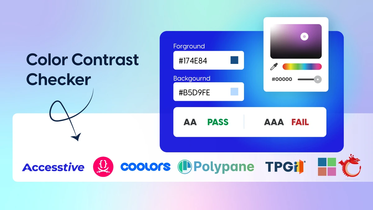
This free online tool offers an intuitive interface for checking the contrast between text and background colors. It provides clear feedback based on WCAG 2.1 Level AA and AAA standards.
- Best for: Designers and marketers looking for a visual, easy-to-use tool
- Strengths: Real-time preview, simple layout, and no login required
- Limitations: Doesn’t include simulation features for vision impairments
2. WebAIM Contrast Checker
A reliable, no-frills tool that evaluates contrast between two colors. It clearly displays whether your combination meets Level A, AA, or AAA requirements.
- Best for: Fast, focused contrast checks
- Strengths: Accurate and lightweight
- Limitations: Requires HEX input; no visual color picker or image support
3. Colour Contrast Analyser (CCA)
A downloadable desktop app that lets you pick colors directly from anywhere on your screen, including screenshots, websites, or software interfaces.
- Best for: Designers testing UI elements outside of a browser
- Strengths: Doesn’t require HEX codes; works on any visible content
- Limitations: Requires installation; no browser version
4. Tanaguru Contrast-Finder
This tool not only checks your contrast ratio but also suggests compliant alternative color combinations when your original pair fails.
- Best for: Adjusting brand colors while staying accessible
- Strengths: AA and AAA support with color suggestions
- Limitations: No drag-and-drop or image upload features
5. Contrast Ratio by Lea Verou
A fast, minimal tool that calculates contrast ratios and supports transparency in colors. Hover over the result to see WCAG pass/fail status.
- Best for: Developers and those working with dynamic styles
- Strengths: Clean and simple
- Limitations: No visual feedback or UI previews
6. Accessible Colors
This web-based tool lets you check contrast and recommends improved color pairs. It also shows you the WCAG grade and visual preview.
- Best for: Content creators and marketers
- Strengths: Easy interface and helpful suggestions
- Limitations: Doesn’t support complex layouts or full palettes
7. Hex Naw
An extremely straightforward contrast checker using only HEX input. Great for checking simple combinations fast.
- Best for: Designers who already have HEX values ready
- Strengths: No distractions, just results
- Limitations: No color pickers, previews, or suggestions
8. Contrast Grid
Generates a full matrix of color pairings to help you test multiple background and foreground colors at once.
- Best for: Brand or design teams testing a full palette
- Strengths: Visual comparison across many combos
- Limitations: Requires manual HEX entry
9. Coolors Contrast Checker
Part of the Coolors design platform, this tool checks contrast between any two colors with a simple, modern interface.
- Best for: Designers using Coolors for palette building
- Strengths: Clean layout, immediate results
- Limitations: Limited to two-color testing at a time
10. Polypane Contrast Checker
Part of a broader web development and accessibility platform, this tool supports both WCAG and the newer APCA standard.
- Best for: Teams needing advanced accessibility auditing
- Strengths: Dual standard checking, responsive previews
- Limitations: Requires installation; paid tool
Common Color Contrast Mistakes (And How to Fix Them)
Even experienced designers and developers miss contrast issues. It’s easy to overlook, especially when you're deep in creative work or moving fast. Here are some of the most common mistakes, and how to fix them without overhauling your entire design.
Mistake 1: Ignoring Hover and Focus States
You check your buttons and links once, they pass, and you move on. But what happens when someone hovers over them or uses keyboard navigation?
Fix: Test interactive states like hover, focus, and active. Make sure these states still meet contrast standards. A simple outline or a color shift can solve this without messing up your design.
Mistake 2: Using Color Alone to Show Meaning
Using red to signal an error or green to show success is common, but not enough. People with color blindness might not notice the difference.
Fix: Always pair color with another visual cue like an icon, underline, bold text, or a short label. This helps everyone understand the message, not just those who see color the same way you do.
Mistake 3: Forgetting About Dark Mode
A light background with dark text may look great, but when users switch to dark mode, things can break. Suddenly, your dark gray text is barely visible on a near-black background.
Fix: Test your contrast in both light and dark mode. Many contrast tools now include dark mode previews. Build your design system with both in mind from the start.
Mistake 4: Overlooking Mobile Contrast
Colors that look good on a large desktop screen may feel washed out or too subtle on a phone. Small text plus low contrast? That’s a problem.
Fix: Preview your design on smaller screens. Use tools or emulators to test your contrast in different environments, and make sure buttons and text remain clear on mobile.
Streamline Your Contrast Workflow with Accesstive
Mastering color contrast is more efficient when you utilize tools designed to monitor and identify technical barriers. Our suite supports your commitment to an inclusive design:
- Access Audit: Instantly identifies potential contrast failures across your site with AI-driven remediation recommendations.
- Access Monitor: Continuously tracks technical contrast health and alerts you to potential regressions in new content or dark mode updates.
- Access Widget: Empowers visitors to manually adjust contrast ratios to meet their specific visual preferences in real-time.
- Access Accy: Assists users in navigating your site, helping to ensure information remains discoverable even when visual contrast is a challenge.
- Access Services: Provides expert manual audits for complex brand palettes and professional testing of hover and focus states.
Final Takeaways
When your text is easy to read, your buttons stand out, and your content feels clear and accessible, people are more likely to stay, explore, and trust what you’ve built.
And the best part? You don’t need to guess.
With the right tools and a few simple checks, you can spot contrast issues early, fix them fast, and build designs that work for everyone.
If you haven’t already, now’s a great time to run a quick color contrast check on your site or app. It only takes a minute, and it can make all the difference.
Try color contrast checker tool today and see what you discover!
FAQ: Color Contrast & Accessibility Tools
Contrast is calculated using relative luminance, the brightness of colors on a scale from 0 (black) to 1 (white). The result is a contrast ratio from 1:1 to 21:1. Most tools calculate this automatically when you input HEX or RGB values.
- AA level means your design meets the minimum contrast requirement for accessibility:
- 4.5:1 for normal text
- 3:1 for large text
- AAA level is stricter and offers better readability for users with low vision:
- 7:1 for normal text
- 4.5:1 for large text
Most websites aim for AA compliance, while AAA is ideal when possible but not always realistic for every design.
A contrast ratio of 4.5:1 or higher is generally considered good for normal-sized text. For large or bold text, 3:1 is acceptable. If you want to go further for enhanced accessibility, aim for 7:1, especially for key content like navigation or body text.
Yes, absolutely. Low contrast can make text harder to read, especially on mobile devices, in bright light, or for users with visual impairments. It increases frustration, bounce rates, and can even prevent users from accessing your content altogether. Fixing contrast improves readability, trust, and overall user satisfaction.
Yes. Dark mode often introduces contrast issues if colors weren’t chosen with it in mind. Always test your design in both light and dark backgrounds to make sure the contrast stays readable in both versions.
Use a color contrast checker tool, just enter your text and background colors, and it’ll instantly show you whether the combination meets WCAG guidelines. Some tools even let you scan your entire website and find contrast issues automatically.
Yes. Buttons, links, and interactive elements should maintain strong contrast when hovered, focused, or clicked. It's a common oversight, but easy to fix once you test those states specifically.
Indirectly, yes. Search engines care about user experience, and if visitors are bouncing quickly because your content is hard to read, it can hurt rankings. Accessibility is becoming a bigger part of SEO strategy.


